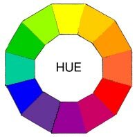
What is hue?
Hue is one of the properties of a colors, defined technically as " the degree to which a stimulus can be described as similar to different from stimuli that are described as red, green, blue, and yellow." Usually, colors with the same hue are distinguished with adjectives referring to their lightness and/or chroma, such as with "light blue", "pastel blue", "vivid blue". Exceptions include brown, which is a dark orange, and pink, a light red with reduced chroma.
In painting color theory, a hue refers to a pure color -- on without tint or shade (added white or black pigment, respectively ). A hue is an element of the color wheel. Hues are first processed in the brain in areas in the extended V4 called globs.

Reference :
http://en.wikipedia.org/wiki/Hue
http://char.txa.cornell.edu/language/element/color/color.htm
What is value?
Value is defined as the relative lightness or darkness of a color. It is an important tool in the way that it defines form and creates spatial illusions. Contrast of value separates objects in space, while gradation of value suggests mass and contour of a contiguous surface. In the drawing on the right, value contrast separates the artichoke from the background, and the separate leaves from one another, while gradation suggests the curves of leave surfaces and of the whole form.
Hue also has value. When contrasting hues are made similar in value, the spatial effects are flattened out. The pair of images on the left demonstrate this. In the color image of the fashion model the coat draws our attention through contrast of hue although the skin tones blend with the background ( remember the object of the image is to sell the coat, not the model ). However, it also seems to be softly blending with a background that seems quiet close,and is very similar to the coat in value. The face tends to blend with the background which is similar in both hue and value. In black and white version, however, the coat virtually disappears, since only value, not hue, are available to distinguish it, and the values are quite similar. However, the strong value contrast of the eyes and hat draw our attention to the face, even though the contours of the face seem to melt into the background. Therefore the black and white version emphasizes the model more than the garment.

Reference :
http://char.txa.cornell.edu/language/element/color/color.htm
What is saturation?
Saturation is also called chroma. Saturation is the purity of a color. High saturation colors look rich and full. Low saturation colors look dull and grayrish. Saturation refers to the dominance of hue in the color. On the outer edge of the hue wheel are the 'pure' hues. As you move into the center of the wheel, the hue we are using to describe the color dominates less and less. When you reach the center of the wheel, no hue dominates. These colors directly on the central axis are considered desaturated. These desaturated colors constitute the grayscale; running from white to black with all of the intermediate grays in between. Saturation, therefore, is the dimension running from the outer edge of the hue wheel (fully saturated) to the center (fully desaturated), perpendicular to the value axis . In terms of a spectral definition of color, saturation is the ratio of the dominant wavelength to other wavelengths in the color. White light is white because it contains an even balance of all wavelengths.


Reference :
http://www.ncsu.edu/scivis/lessons/colormodels/color_models2.html
http://www.greatreality.com/color/ColorHVC.htm
What is secondary color?
Primary colors are colors that cannot be created through the mixing of other colors. They are colors in their own right. The three primary colors are Red, Yellow, and Blue.
Primary colors can be mixed together to produce secondary colors.
| YELLOW |
+
| BLUE |
=
| GREEN |
| BLUE | + | RED | = | PURPLE |
| RED | + | YELLOW | = | ORANGE |

Reference :
http://www.abcteach.com/free/c/colorcharta_ps_rgb.jpg
http://www.technologystudent.com/designpro/pricol1.htm
What is tertiary colors?
Tertiary colors are combinations of primary and secondary colors. There are six tertiary colors; red-orange, yellow-orange, yellow-green, blue-green, blue-violet, and red-violet.


Reference :
http://www.colourtherapyhealing.com/colour/tertiary_colours.php
http://en.wikipedia.org/wiki/Tertiary_color
http://moonleafstudios.wordpress.com/2011/11/01/some-color-theory/
What is analogous colors?
Analogous colors are groups of colors that are adjacent to each other on the color wheel, with one being the dominant color,which tends to be a primary or secondary color, and two on either side complimenting, which tend to be tertiary.
The term analogous refers to the having analogy, or corresponding to something in particular. An analogous color scheme creates a rich, monochromatic look. It's best used with either warm or cool colors, creating a look that has a certain temperature as well as proper color harmony. While this is true, the scheme also lacks contrast and is less vibrant than complementary schemes.
Red yellow and orange are examples of analogous colors.


Reference :
http://en.wikipedia.org/wiki/Analogous_colors
What is tint?
A tint is a color to which white has been added to make it lighter. Take pink, for instance. Pink is a color, but it's also a tint of red. Tint is a color term commonly used by painters. A tint is a mixing result of an original color to which has been added white. If you tinted a color, you're been adding white to the original color. A tint is lighter than the original color.


Reference :
http://www.workwithcolor.com/color-properties-definitions-0101.htm
http://en.wikipedia.org/wiki/Tints_and_shades
http://www.allbusiness.com/glossaries/tint/4944085-1.html
What is shade?
Shade is a color term commonly used by painters. A shade is a mixing result of an original color to which has been added black. If you shaded a color, you've been adding black to the original color. A shade is darker than the original color. When used as a dimension of a color space, shade can be the amount of black added to an original color. In such a color space a pure color would be non-shaded.

Reference :
http://www.workwithcolor.com/color-properties-definitions-0101.htm
What is monochromatic colors?
Monochromatic colors are all the colors ( tints, tones, and shades ) of a single hue. Monochromatic colors schemes are derived from a single base hue, and extended using its shades, tones and tints ( that is, hue modified by the addition of black, gray (black + white) and white. As a result, the energy is more subtle and peaceful due to a lack of contrast of hue.

http://en.wikipedia.org/wiki/Monochromatic_color
Warm color
The colors of red, orange, and yellow are considered warm colors because they are the colors of fire. These hues are also said to advance, meaning they appear to come forward, making the walls feel closer.


Reference :
http://interiordec.about.com/cs/colorindecor/f/faq_warm_colors.htm
Cool colors
Blue, green, and violet are considered cool colors. When you think of a cool lake or ice covered pond, you see cool colors. Because these colors have a tendency to feel like they are receding ( or backing away from you ), cool tones are often used to paint the walls of small room to make the room appear larger.

Reference :
http://interiordec.about.com/cs/colorindecor/f/faq_cool_colors.htm


